
The summer always brings out the best in me. ☀️ The world feels a little bit lighter and brighter, and I can feel my energy increasing by the day. Honestly, it’s no wonder that a lot of brands find themselves feeling inspired by the summer sun! A summer-inspired brand can feel really welcoming, cheerful, and full of life.
Whether you’re looking for a brand refresh or want to start from scratch, this summer branding inspo will help you brainstorm ways to bring that liveliness to your own colors, logo, and web design.
Want summer branding inpo? Pin to save!
Summer Branding Inspo
When you think of summer, you might imagine days spent at the beach with a drink in hand or watching sunsets with your family on vacation. These images and ideas of summer can serve as your brand inspo.
Let’s look at how summer can influence your brand and offer some website design inspiration.

Logos and Icons
One of the most basic parts of a brand is your logo. There are lots of ways to bring summer into your logo, including typography, colors, icons, and more.
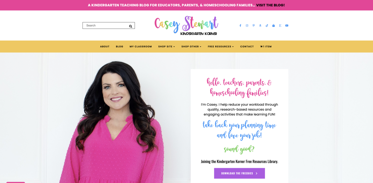
Take a look at Kindergarten Korner, for instance. When designing her logo, I wanted to embrace the silly and youthful spirit of kindergarteners. The typography mixed with the bright colors gives off a peppy, upbeat vibe!
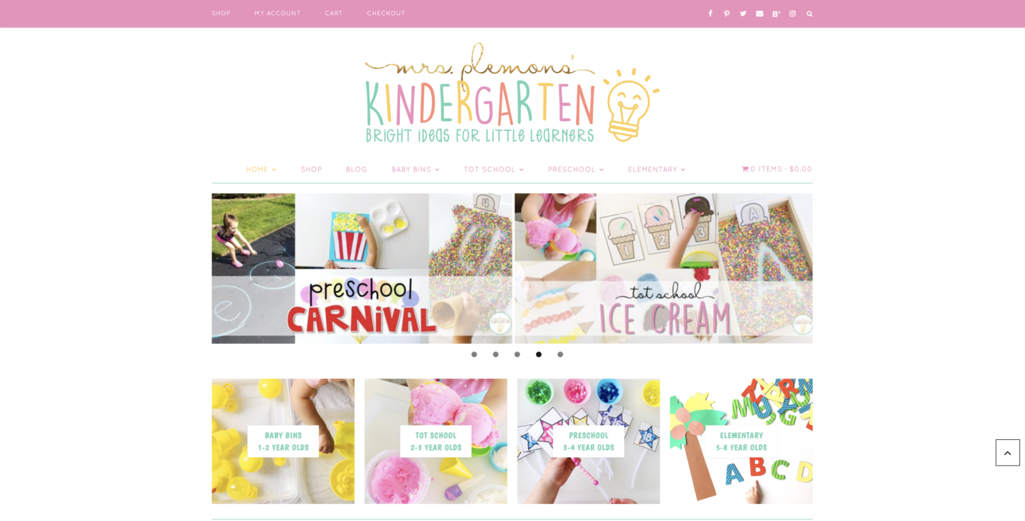
Mrs. Plemon’s Kindergarten logo is also great summer branding inspo. The “Mrs. Plemon’s” text is metallic gold which reminds me of a bright summer sun. The “kindergarten” text is misaligned for a youthful and cheerful feeling.
Brand Colors
There is a lot of opportunity to bring those summer vibes into your brand colors. From summer sips like lemonade to summer destinations like the beach, there is a lot of branding inspo already out there.
Just take the Cream City Teacher, for example! Her color palette includes bright neon colors like green, pink, and orange. The whole palette reminds me of a decadent fruit bowl or popsicle stand. I think a lot of people shy away from bright colors, but I designed Cream City Teacher’s website with lots of negative space to help the neons pop (but not overpower) her site.
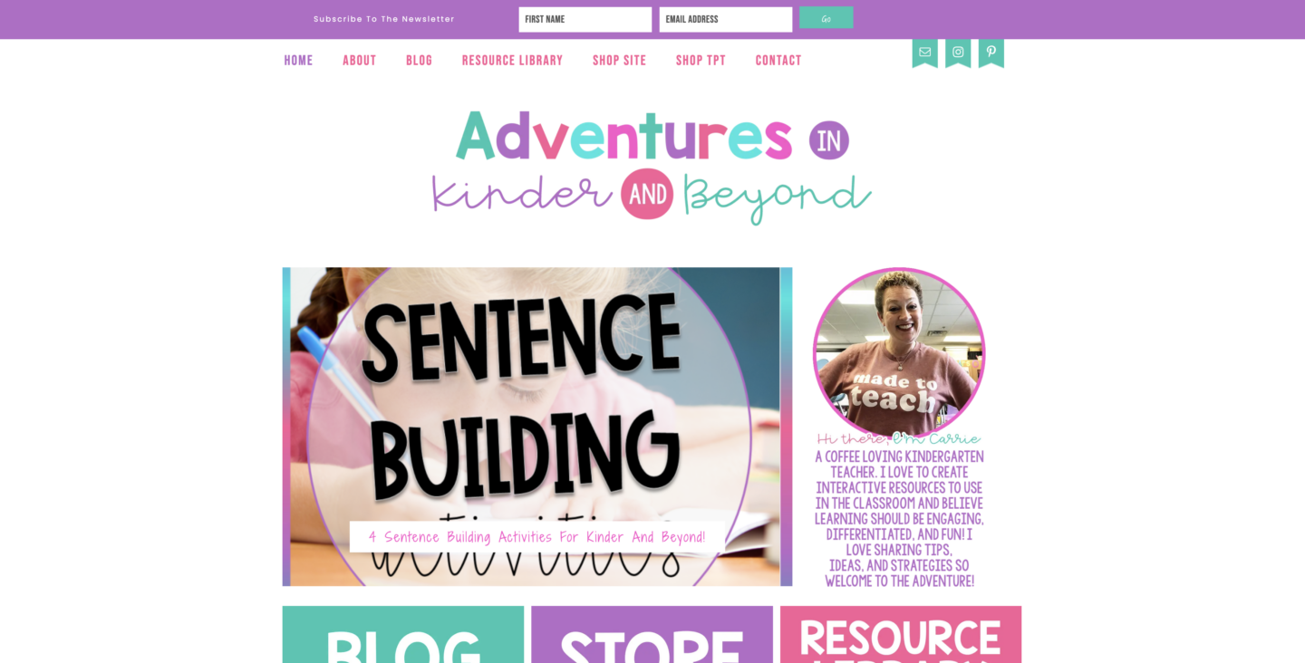
Adventures in Kinder and Beyond colors definitely has a summery vibe. Her color palette brings together some ocean-inspired colors (teal and aqua, and we know how I feel about those colors 😉) mixed with pops of pinks and purples, like a sunset. The colors are really warm and inviting, which really speaks to her brand.
Photography
Of course, what is a brand without photography? These can be your stock photos or brand photos. It’s always a good idea to have complimentary photos that enhance your other branding elements.
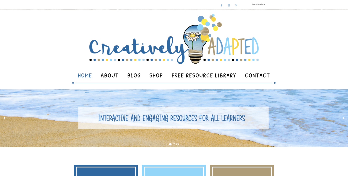
Creatively Adapted is the perfect example of this. Her branding inspo is the beach, which you can see in her colors (shades of blue and brown) and her photography. Throughout her logo and website, you’ll find images of the beach, ocean, and starfish.
Looking for a website design refresh or update? Book my Website Design service! You’ll get five brand-new pages for your website, plus branding customization. Let’s work together on your WordPress site! Schedule a free discovery call, and we’ll chat about your project.

be the first to comment